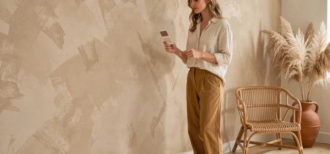
A wall painted in warm sand changes the perception of an entire room. This shade, halfway between golden beige and golden cream, captures natural light and redistributes it softly. Warm sand-colored paint is part of the warm neutrals that, since 2025, are gradually replacing cool grays in French interiors. Understanding what makes this hue so versatile allows it to be used without falling into monotony.
Undertones of warm sand paint: what really changes the final result
Have you ever noticed that the same can of sand paint can look straw yellow in a south-facing living room, and almost pink-gray in a hallway without a window? It all comes down to the undertone.
Warm sand always contains a yellow or orange base. It is this base that distinguishes it from classic beige, which is cooler, and taupe, which leans towards gray. When the undertone leans towards ochre, the wall gains depth. When it leans towards pink, the atmosphere becomes cozier.
Before buying a can, test a sample directly on the wall in question. Observe it at three times: in the morning with low light, at noon in direct light, and in the evening under artificial lighting. The ochre or pink undertone determines the entire ambiance of the room. A cool white LED light, for example, pulls the sand towards gray and makes it lose its warmth.
To choose a warm sand-colored paint suitable for your space, remember this simple rule: bright room, golden undertone; dark room, peach or light apricot undertone to compensate for the lack of natural light.
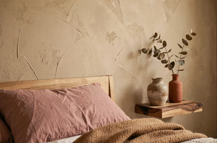
Sand paint and bio-sourced resins: the indoor air quality criterion
The sand trend is not just about aesthetics. Major DIY retailers now offer wall paints rated A+ for indoor air quality in warm sand shades. Some ranges incorporate bio-sourced resins, reducing the share of petrochemical components.
A paint rated A+ emits very few volatile organic compounds after application. For a bedroom or living room where one spends several hours a day, this criterion is as important as color.
When comparing cans in-store, look for the regulatory label on indoor air emissions. A quality warm sand paint displays this classification and specifies whether the resin is bio-sourced. The matte or velvet finish does not change this fact: it is the chemical composition that makes the difference.
Color combinations with warm sand for a living room or bedroom
Warm sand is a neutral, but a lively neutral. It does not behave like white. Pairing it with any color without thought can yield a dull or messy result.
Warm sand and terracotta shades
The most coherent combination in 2026. Terracotta shares the same color family (earth pigments) as sand. Warm sand on the walls, terracotta in accessories or on a single wall: this combination creates a warm envelope without harsh contrast. A cream linen sofa or a cream rug balances the whole.
Warm sand and sage green
Sage green brings the vegetal freshness that prevents sand from appearing too mineral. On a living room wall, sand serves as a backdrop; sage green comes in touches, on a painted piece of furniture, cushions, or a plant frame. The effect recalls Mediterranean landscapes without being overpowering.
Warm sand and off-white
Why not just paint in white? Because pure white creates too sharp a contrast with warm sand. Off-white (cream or ivory undertone) softens the transitions between painted wall and ceiling or woodwork. The eye flows smoothly.
- Terracotta for a warm and mineral atmosphere, ideal in a north-facing living room.
- Sage green for a warm-cool balance, suitable for living spaces opening onto a garden.
- Off-white for moldings, baseboards, and ceilings, to maintain a soft coherence with the sand walls.
- Blue-gray in small doses (vase, bedding) to provide a discreet contrast point without breaking the warmth.
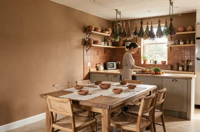
Matte or satin finish: choose according to the room and use
The finish alters the perception of color as much as the undertone. A warm sand in a matte finish absorbs light and gives a powdery, almost textile appearance. This is the most common choice for bedrooms and living rooms.
The satin finish, on the other hand, partially reflects light. It is better suited for high-traffic areas (hallway, entrance) or walls exposed to wear. The satin finish is more resistant to marks and is easier to clean than a matte.
A velvet finish sits between the two. It offers a slight reflection without the shiny aspect of satin. For a living room, it is often the best compromise between aesthetics and practicality.
- Matte: bedroom, office, accent wall in a calm living room. Hides small imperfections of the surface.
- Velvet: living room, dining room. Light reflection that enlivens the surface without a mirror effect.
- Satin: hallway, entrance, open kitchen. Resists splashes and can be wiped clean with a sponge.
Preparing the wall before applying warm sand paint
A light and warm shade reveals every flaw in the surface. A poorly filled hole, an old moisture stain, an uneven coating: everything shows up under low light.
Start by washing the wall with Saint-Marc detergent or equivalent to remove dust and grease. Fill in cracks with smoothing compound, then sand with fine grit once dry. Apply a universal white primer before the sand shade to uniform the absorption of the surface.
Without a primer, warm sand can turn a dirty yellow on an old colored wall, or absorb unevenly on new plaster. Two coats of sand paint over the primer are usually sufficient for a uniform finish.
Warm sand works in almost every room, from the living room to the bedroom. Its strength lies in its ability to serve as a backdrop without imposing a unique style. A Scandinavian minimalist interior or a Mediterranean-inspired decor can accommodate it just as well. The choice of undertone, finish, and associated colors makes all the difference between a bland wall and one that truly structures the room.